Bob Shockey is the founder and lead architect at Alchemy Group, a full-service software design and development company based in Southern California. With over 30 years of experience in visual design and database development, Bob leads a team dedicated to building simple, useful, and beautiful software solutions tailored to your needs - especially for businesses facing operational complexity.
After earning his degree from Otis Art Institute in 1986, Bob built a long and successful career in publishing and visual effects, blending design and technology to solve creative challenges. His interest in workflow optimization led him to FileMaker, where he discovered a platform that combined structure with creative freedom. That discovery became the foundation for The Alchemy Group, which he founded in 1999 to help businesses simplify complex operations through custom software.
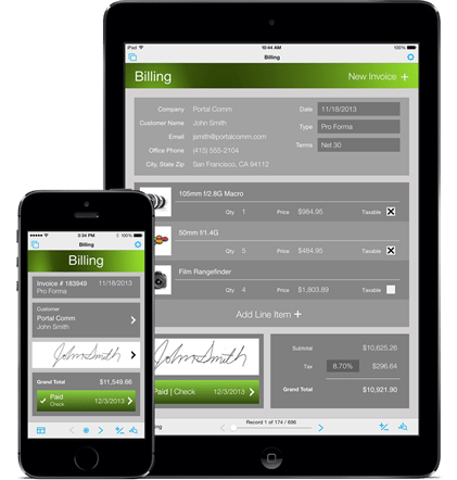
Bob specializes in solving difficult business problems like field service coordination, scheduling, estimating, inventory control, and workflow automation. His solutions are used daily across industries to improve accuracy, reduce waste, and streamline operations - including a recent mobile job-routing and payment system that helped a field service company go paperless and more profitable.
As a FileMaker Certified Developer, Bob has spoken at FileMaker DevCon (San Diego, San Antonio, Miami Beach), Pause on Error, and FMDiSC events on topics including customer support, interface design, and business process optimization. He’s also been featured on the Fireside FileMaker podcast and serves on the FMDiSC Advisory Board, helping mentor the next generation of developers. His early innovations earned him the top prize in the FileMaker DevCon Solution Contest (2004).
Outside of work, Bob is a professionally trained artist and lifelong student of music, martial arts, and creativity. He lives in Southern California with his wife and daughter.


