Many developer types are confused about the entire topic of typography. What’s the big deal? If you can read it, it’s working, right? Not necessarily. In part 2 of the “Getting Started with Design” series, we will explore what makes type so important to a design, and how to get past some of the challenges of using it effectively in a cross-platform environment.
Of all of the methods for communicating information, the most advanced one we have is the written word, something which has evolved over millennia to share information, convey nuance, and prompt new insights. Not surprisingly, it?s also the primary tool we use in database design. Interestingly, many database designers take little more than a few seconds when making a font choice. After all, there are only a few fonts that are guaranteed to be installed on every system, fewer yet if you have to work across both Mac and Windows platforms. Some look more modern, some look older, though you may not be able to put your finger on why. This appears to be the extent of the thought process behind font selection for some; below, I will attempt to give you further guidelines to help you make better choices.
There is more to selecting a font than you might think. For example, how formal or informal do you want your system to appear? How important is readability ? and by extension, what age group do your users fall into? What is the font’s readability on screen? On the printed page? Are your users being asked to read large blocks of text, or just a few words at a time? And, of course, how well will the font perform across platforms?
FileMaker limits us to a handful of fonts, because we rely on the system fonts found on most computers. Luckily, there are places we can turn to for answers on what fonts are commonly found on most systems, so at least we know what we can expect to find most anywhere. The unfortunate thing is that these are a pretty uninspiring family of typefaces. FileMaker has not yet caught up with the Web in terms of allowing a greater range of font choices (embedded web fonts have been available to web designers for years, opening up a vast array of possibilities when designing for the Web). Here is the list of fonts that we can expect to find on most any system (even these cannot be hoped for 100% of the time):
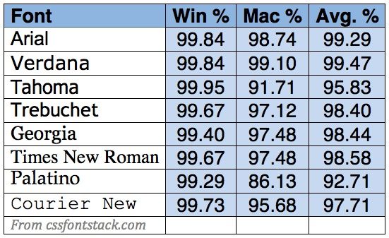
As you can see, the choices are very limited if we are going to stick to fonts that work across platforms. I always recommend sticking to xplat fonts, because even if you think you are developing an app that is solely for Mac or Windows, an ugly duckling will eventually find its way into the nest. And, of course, we have iOS devices to consider as well. Luckily, all of the fonts in the above chart are available on iOS 7 or higher, except Tahoma.
You might think that, in a controlled environment, you could install any font you want across multiple machines. You could even store the font in a container so that it is readily available to users. While this may be an option, consider two things: first of all, font files sometimes conflict with others, so installing a font on a system can occasionally have unpredictable results. Also, in my experience, there is always someone who brings in a laptop or other computer or device that does not have the font installed. This can happen completely under everyone’s radar, and again, the results of not having the correct font can be unpredictable in terms of how your data is being presented to this type of user. It’s less likely that you will end up with a sudden issue if you stick to the standard font library.
So, what font(s) shall you use? The following is a basic breakdown of the common fonts by type and attributes.
Arial: Helvetica’s brother (in law).
![]()
There is a very entertaining film called Helvetica that you most likely have never heard of unless you are a design geek like me. You may wonder why an entire film might be dedicated to a single font, but that’s exactly the point: most people don’t understand the seismic shift in typographic design that Helvetica caused. It’s everywhere. Countless logos use it, and it is probably the most commonly used font in modern design. Why? It’s boring. It’s simple. It never gets in the way.
Arial is almost identical to Helvetica. Almost. In fact, Arial was designed by Microsoft in the ’80s to be virtually identical to Helvetica, to avoid licensing fees for using the actual font. There are subtle differences between the two, and most designers will choose Helvetica first. But Arial is found on most systems, and Helvetica is not. The good news: it does not change all that much across platforms.
How I use it: Arial is nice for creating clean looking reports. It scales very well, although it’s almost offensive in its uniformity when blown up to a large size. It can work well as a screen font, but it’s not my first choice for a fast read.
Verdana: the Klingon in the room.
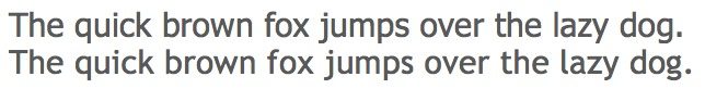
![]() You wouldn’t want to sit down to a meal next to Verdana. It’s all elbows. Compare the Verdana line of text to the Arial one above. It’s about 20% wider, and that’s the Mac version – put it on Windows and it will grow even more. Part of what makes it such a space hog is its kerning. In typographic terms, kerning is the natural spacing between the letters. Verdana’s airy kerning gives it a high readability at the expense of space economy.
You wouldn’t want to sit down to a meal next to Verdana. It’s all elbows. Compare the Verdana line of text to the Arial one above. It’s about 20% wider, and that’s the Mac version – put it on Windows and it will grow even more. Part of what makes it such a space hog is its kerning. In typographic terms, kerning is the natural spacing between the letters. Verdana’s airy kerning gives it a high readability at the expense of space economy.
Verdana is also the first of our Humanist family of fonts. Where modern sans serif fonts like Arial are monotonously uniform in the width of the strokes, humanist fonts have thick and thin strokes, which gives them a friendlier, more casual look.
How I use it: I used to use Verdana almost exclusively as a screen font, until I got tired of seeing it expand in xplat systems. To be honest, I rarely use it for anything any more. Maybe if I give it a really long time out, it will learn to behave. QI’yaH! wej drapes!
Tahoma and Trebuchet: Laid back cousins
 These dudes are cool. In Hitchhiker’s Guide parlance, these cool froods really know where their towels are. Why do I say this? Because they are always casual, but not in a shirtless, L.A. swim trunks and flip-flops way; more like a Portland, “here drink this, I brewed it myself” kind of way. Tahoma and Trebuchet are humanist fonts, without the annoying bad habits of Verdana. They are comfortably narrow, yet highly readable. Trebuchet is the more casual of the two, and may be a little too so for some business applications. Both are very inviting and present a less formidable tone to a new user who may be naturally suspicious of the new app the boss just ordered him to use.
Trebuchet is found on Windows, Mac, and iOS, making it preferable for continuity of look and feel when all three platforms are in use. The same cannot be said for Tahoma, which is common on Mac and Windows, but is not found at all on iOS.
How I use them: these are my go-to fonts for screen display. I use Tahoma most of the time, and Trebuchet when Tahoma is not an option. I am not overly fond of some of the elements of Trebuchet, but that’s a personal thing; make up your own mind.
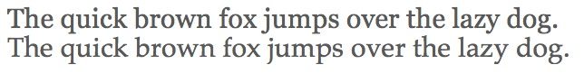
?Times New Roman: your uncle, the soldier.
![]()
Times is the first of our serif fonts. What’s a serif, you ask? It’s that little foot on the bottoms (and tops) of the letters. Serif fonts are the oldest type of fonts still in use today ? don’t be ageist, that doesn’t make them any less valuable to society. Times New Roman is old enough to have served in WWII, and was used in the British newspaper The Times for 40 years. It certainly stands on ceremony, with a somewhat stiff, dignified look.
How I use it: Times New Roman is best suited to printed reports, and it excels at this. It has long been claimed that serif fonts have higher readability for blocks of text, and I believe this to be true, though not for the reasons normally given. I tend to apply it to contracts and other reports containing paragraphs of type.
Georgia and Palatino: jitterbugging to T&T’s beat.
If Tahoma and Trebuchet are the laid back sans-serif fonts, Georgia and Palatino are their dates. These are the other two serif fonts, and they are certainly graceful and easy on the eyes. Georgia has a heavy look to it, so you have to be careful about using it for large text blocks, lest things start to look muddy. But it can be a nice accent font for larger text. Palatino is a great all-purpose serif font, with beautifully open letterforms and a high degree of readability. It reduces to smaller sizes well.
How I use them: Palatino works great as a secondary font to a more formal sans-serif like Tahoma or even Arial; I like to use it in italic form, and having the serifs mixed in with more plain forms really jazzes things up. I rarely use Georgia, but I don’t think I have a good reason for that, except that it lends itself more to larger type, and I am in the habit of using sans-serif fonts for that. It’s not really fair, but design is full of bias.
Courier New: your other uncle, the accountant.
![]() Fixed-width fonts serve a very important purpose: columnizing data. When you have columns of numbers to add up, it’s a lot easier to do this when they are all the same width, and you can’t count on most regular fonts to provide that. Courier New to the rescue! This egalitarian font gives the exact same amount of space to an “i” as it does to a “W”, or to a 1 as it does to a 5.
Fixed-width fonts serve a very important purpose: columnizing data. When you have columns of numbers to add up, it’s a lot easier to do this when they are all the same width, and you can’t count on most regular fonts to provide that. Courier New to the rescue! This egalitarian font gives the exact same amount of space to an “i” as it does to a “W”, or to a 1 as it does to a 5.
How I use it: for me, there is only one reason to use Courier New, and that’s what I have just described. It’s fixed-width nature makes it a difficult font to use for reading large text blocks, although many email clients use fixed-width fonts this way. You may also notice that text editors used for coding employ Courier; this is no accident, as it’s much easier to analyze code when there are no stylistic trappings getting in the way.
?Into the Woods
While FileMaker gives us a frustratingly small “palette” of fonts to choose from, this enforces one good habit: you should only use one or two screen fonts in a solution, three if you include the occasional use of a fixed-width font. Similarly, you should stick to one or two fonts in your reports, though these may vary from your screen font choices. The reason for all of this is simple: you want to create an overall sense of consistency across your solution. Consistency promotes user confidence.
One of the questions that I hear frequently is, “is it okay to mix serif and sans-serif fonts?” The answer is yes, if it is done for a reason. For example: I like sans-serif fonts for large type over, say, 14 points. However, for smaller type, I find that serif fonts reduce better, and I might use Palatino for that. This also creates a natural point of difference between two type elements (see my next post for an explanation regarding points of difference).
Using the guidelines above, you should be able to make an intelligent choice about what font will work best for your system. Next up: designing your type lexicon. This is just a fancy way of asking yourself the question, “how am I going to use type styling to communicate with my users?”
If you have ever attended one of my DevCon or Experience & Style sessions, you know that I approach design from the standpoint of information hierarchy. The data that you present at any given time has a relative importance to the other information on the screen. Sometimes, the information is presented in blocks, or logical groupings (e.g. name, address, city, state, zip, country). You need to manage these in such a way that things that go together are placed correctly, and things that are different appear differently on the screen. This creates, once again, an intuitive experience for the user. In Part 3 of Getting Started with Design, we will explore information hierarchy in depth.