

In part 2a of my series, “Getting Started with Design,” I outlined in detail the differences between the various fonts available to FileMaker developers. In this article, I will describe how to use type effectively, using information hierarchy and differentiation.
Information Hierarchy is just a fancy way of saying, “how my client thinks about their data.” Or, to be more precise, “how my client thinks about their data in context.” What I mean by this is, your client may not approach information the same way when looking at, say, a client’s address on an invoice vs. the same address on a contact info screen. This is an important distinction, because you should?determine two key factors before beginning any layout design: importance and logical grouping.
Importance is simply how important a piece of data is in relation to all of the other pieces of data being viewed in that context. I like to determine the primary piece of data first — on a main customer info screen, it may be the customer’s name or the company they work for; on a job detail screen, it may still be the customer name, or maybe it’s the job description or when the job is due. This is the most noticable item on the screen, because it serves the purpose of orienting the user to that screen’s primary function (fig. 1).
Imagine it this way: a system where each and every screen has common navigation elements placed exactly the same way, but each screen also has a unique, instantly identifiable main element that tells me, with certainty, where I am in the system. This is what I strive for in my database design.
Logical Grouping
Once I have identified the primary data, I can move on to all of the other bits, keeping in mind how they relate — or don’t relate — to the primary data. This helps me fit it all together in a way that will make sense to the user, and will inform me on what chunks belong together and which should be isolated.
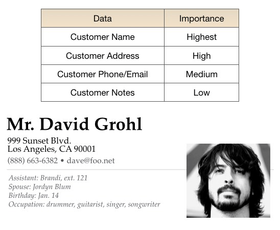
Figure 1: a simplified version of information hierarchy, and what the result might look like.
Note that the most important information is greatly emphasized, and other, relevant
information is placed and emphasized based on its relationship to that primary element.
Once you know a thing or two about what’s important and what chunks belong together, it’s time to start pulling it all into a cohesive whole. Just as each of the individual elements of a block of text have a hierarchy, the different regions of the layout also may have a hierarchy. This may be based on importance, but it may also follow the flow of the reader’s eye across the page, or the logical progression of the user’s work process. Let’s examine a way of dividing things up by block that is at once pretty basic and relatively effective.
When dividing things up by blocks, I apply the same principles as I did with individual data in my hierarchy, but on a larger scale. Now, I am thinking of things in terms of blocks of information that belong together. The address block I created in Figure 1 is one block — it all relates to an individual, how to contact him, and some crucial info to know when we do so. But there may be other blocks on the screen, each with its own degree of importance (fig. 2).
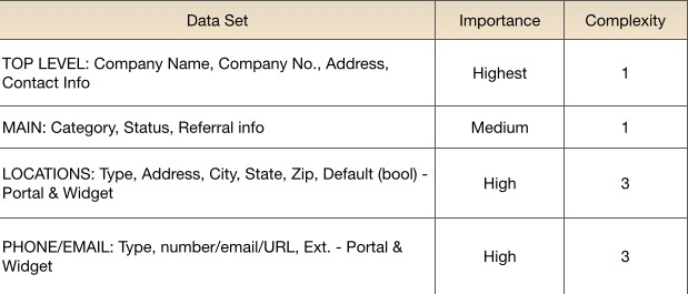
Figure 3
Complexity
Note that I have included a column that helps me understand the complexity of the block. This becomes important when I am prioritizing and placing the information on the screen or page. If a block contains a lot of different elements – checkboxes, pop-up menus, iconized tyographic elements, then it will have an effect on where I can place it.
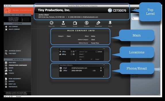
Figure 3: Data identified by block on a screen
In Figure 3, you can see the blocks that have been created based on the established hierarchy. I am not necessarily advocating that you should go through a formal process like this for every single screen you produce. I am, however, suggesting that you give this a try if you find yourself feeling stuck or overwhelmed. It’s a great way to solve difficult problems.
Differentiation
When I talk about differentiation, I’m really talking about giving the user visual cues that will make it easier and faster to parse the information on the screen or printed report. Typography gives us lots of tools that people are used to noticing already – we have all seen different fonts, styles like italics or bold, and are familiar with sizing and coloring type to lend urgency or emphasis. These tools are already at our fingertips, so we should use them.
Of course, what the user does not necessarily know is how you, in particular, are using the many different typographical differences she sees. What amazes me is that many developers do not fully understand what they are presenting to the user. That’s why you should establish and faithfully follow a lexicon that makes it clear just what everything means (fig. 4)
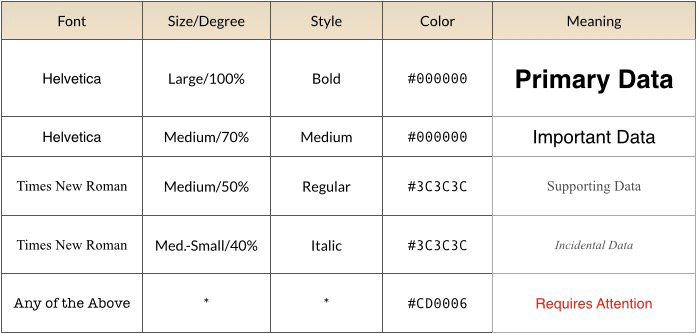 Figure 4: a lexicon of ascribed meanings for text elements used in an interface.
The fonts and colors you use can mean, literally, anything you want. However, users have come to expect certain things, e.g. larger type is more important, or red type may mean that special attention is required. So while you should use type in whatever way you deem relevant, be aware of accepted conventions before you decide to circumvent them.
Here are some of the properties of your type to which you can assign specific meanings:
- Font
- Size
- Weight
- Style
- Case
- Color
- Highlight
- Alignment
…and here are some possible meanings (not in any way a definitive list):
- Importance (hierarchy)
- Information type or source
- Recently changed
- Requires attention/intervention from user
- Valid/invalid value
- Matches a search term
- Hyperlink or otherwise actionable
It’s important that you are very consistent. If you are giving a speech and you use words from many different languages in a jumble, chances are no one will understand you. It’s the same way with your lexicon. It can be whatever you want it to be, but it must do so consistently in order to have meaning.
Hopefully, you can use some of these skills and thought processes to futher refine your FileMaker layouts. Happy designing!


