Achieving color harmony is a constant pursuit for designers of all types, whether the field is graphic design, interior design, package design, etc. Luckily, the Web gives us lots of tools to help take some of the guesswork out of creating a great color palette. But before we go there, let’s take a moment to understand how color can be used in a FileMaker solution, and why it’s such a crucial element of good design.

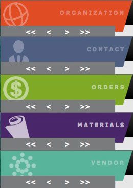
Figure 1: Color used to denote a module. These take up only about 2% of the window real estate, but have a powerful mnemonic quality. This orients and reassures the user, building confidence in the system as a whole.
When it comes to mnemonics – memory triggers that all humans use to orient themselves or recall information – color is one of the most effective there is. While 5% of the population cannot use this due to color blindness (thus making it unreliable as an exclusive tool), most people will react positively to color as a way to remember things. This makes your color palette one of the most powerful tools in your toolbox. I tend to use color to denote various modules within a system (figure 1). Color can also be used to denote the status of a project, delivery, production line, or any other logical separation within your system. Some Dos and Don’ts:
- Use color in a limited way. A good rule of thumb: color area should be inversely applied proportional to it’s brightness. The brighter the color, the less screen area it should cover.
- Avoid large, colored backgrounds unless it’s a splash screen that you display on a home/main menu screen.
- Use colors that work together, even if you don’t see them side-by-side. When switching from one window to another, the brain retains an impression of the previous color seen while processing the next.
So why not just pick some colors you like from FileMaker’s standard palette and be done with it? Because people also inherently understand color as something occurring all around them, and they react to it constantly. Wander around a shopping mall, just observing the colors in the banners, posters, and products you see. After a while, you might start to get a sense of how color is being used today, and how certain color tones are being used over and over again. In fact, Pantone produces a color “forecast” every year that is used heavily by designers in all industries. While I would strongly caution against trying to keep up with every trend (databases are still in use long after clothing goes out of style), you should attempt to find color harmony that echoes today’s sensibilities. With a little pre-planning, you can avoid creating a system that looks like it was in style when the original Star Trek was on TV.
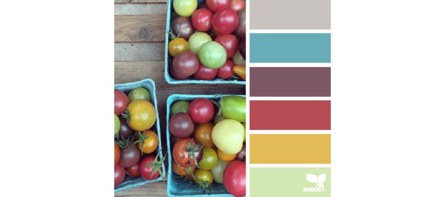
As I mentioned above, there are plenty of resources online to help you pick a great color palette. My favorite is design-seeds.com. Using photographs from multiple sources, colors are extracted to create a harmonious color palette. Some of these are too narrow in the number of actual colors used, i.e. just a few shades of purple. But scroll through them and you will find lots of great color palettes that can be applied to your system with little extra work on your part. I like to grab these palettes and pin them on a Pinterest page for future use. You can also show these to your client before you invest a lot of time using colors they may not like. Other great sources for color ideas are Adobe Color CC (formerly Kuler), Color Lovers, Color Combos, Color Explorer (great for uploading a photo to extract the colors from it); if you find a web site you like, and you want to easily extract its colors, try I Like Your Colors. And just for fun, Take a look at Movies In Color, where you can see color palettes extracted from many different films.
Once you have a color palette in place, I think you will find that visualizing the final look of your database solution has gotten easier. Plus, this is a fun way to dip your toe in the deep waters of design, while solving one of its more perplexing aspects. Happy designing!


