Key Takeaways
-
Themes and styles are powerful FileMaker tools that are frequently underutilized: When applied correctly, named styles enforce design consistency, reduce file weight, and allow developers to switch an entire solution’s visual language by changing a single theme, without touching individual objects.
-
Style names must remain attribute-neutral to survive theme changes: Including visual characteristics like color, alignment, or font size in a style name creates fragile designs; when themes change, those named attributes no longer apply, defaulting objects to a generic style and breaking the intended layout.
-
A structured naming convention protects long-term maintainability: Using a hierarchical, dot-separated system, such as type, group, region, and focus, keeps style names short, readable, and portable across themes, making it easier for any developer to understand and extend the solution.
At this year’s FileMaker DevCon in Dallas, when discussing this topic, I found that many people have a problem with how to organize, name, and even think about styles. This is understandable, because styles have a multi-dimensional aspect to them that complicates matters greatly. I’m referring to the ability of FileMaker to apply a different set of styles to similarly named objects across themes (“skinning,” in software design parlance). You can have two different styles with the same name in two different themes. Changing the theme from one to the other will apply the appropriate attributes to a similarly named object, as long as it is of the same type.
This is very useful because clients simply won’t, upon occasion, connect with the overall look of the system you have designed for them. Having the ability to simply change to another pre-designed theme is a huge time- and hassle-saver.
As awesome as this is, the inherent difficulty in this kind of theme management is compounded by attributes that may be specific to only one theme, yet are worth mentioning in the naming of the style. For example, one theme may be designed with all field labels (text objects) aligned right, while another might have them all aligned left. This appears to be useful information to have, but if you append “_rightalign” or “align_left” to your style’s name, it may not translate across when you change the theme. If the style’s name is not found in the new theme, the Default style will be applied instead. What to do?
There are rules you can follow, to help you stay on the right path. I’m going to outline mine here, but I want to stress that you can choose to be as strict or loose with these as you want. This article is more of a prompt to get you thinking in new ways than it is a rule book.
1. Get used to Show All
I have found it useful to click the “Show All” check box at the top of the Styles inspector. This gives me insight into the overall list of styles I have assigned for my theme. More importantly, it helps me check for consistency across the many object types FileMaker provides.
2. Don’t be too specific
As mentioned above, things like alignment are best left out of the style’s name. Other things you may want to leave out are color, font, size, and styling characteristics like bold, underlined, italic, etc. These are the things that are most likely to change across themes. That said, you may find that your rules are different – e.g. you may consistently use various alignments for all of your text elements in all of your themes, in which case it makes sense to get that specific.
3. Use a standardized naming convention and stick to it as much as you reasonable can.
At Alchemy Consulting Group, we choose to follow a very specific naming convention. It consists of up to four segments, starting with the most general info about the style, and progressively becomes more specific. The format is easy to understand:
TYPE
GROUP
REGION
FOCUS/NOTE
…all separated by periods, which are compact enough to help with viewability in the narrow Inspector palette: TYPE.group.region.focus/note
TYPE is used to denote the kind of object this style is used for, whether it’s a text object, a button, or a slide control. This is very useful when you are viewing all of the styles at once. We use a two-letter naming convention as follows:
BG = Layout Background
PT = Part
LN = Line
SH = Shape
EB = Edit Box
DD = Drop-down List
PU = Pop-up Menu
CL = Drop-down Calendar
CR = Container
TX = Text
BB = Button Bar
BN = Button
TB = Tab Panel
PL = Portal
PO = Popover
SC = Slide Control
This is really nice when you want to skim through all of your styles to refresh your memory on how you named something.
The second segment, GROUP, is a bit more abstract. For me, I use it to denote what major function the style applies to. For example, in most layouts sporting a UI, there are plenty of objects devoted to navigation, searching, and audit logging that can similarly be found on other layouts. I refer to these in the common programming parlance as “chrome.” Otherwise, the style is probably used for data — information specifically entered and controlled by the user.
.chr = chrome
.data = data
.label = field label
.all = a wildcard style that can be applied anywhere
You could break these down further; for example, you could denote all navigational elements as “.nav” or items that are always hidden in Browse mode as “.hidden.”
Segment three, REGION, is a way to describe what component the style may be associated with. A good example is a field that is primarily designed to show up in portal rows (.portal). Another would be a navigation button that is designed to reside in a footer (.footer), or a field designed to show up in a data entry card window (.card). Sometimes it does not make sense to restrict the style to this kind of criteria, in which case you could just skip this part.
The last segment, FOCUS, is a more specific bit of information, having to do with information hierarchy. In web design, it’s not uncommon to use terms like “high focus,” and this is very much done for the same reason as having matching style names in FileMaker. It’s general enough that it could apply in any theme, but just specific enough to get the idea across. The difference, of course, is that FileMaker layout design is not web design. As anyone who knows me will tell you, I have strong opinions about why our layout designs should not too closely mimic web pages. Suffice it to say that FileMaker layouts can have a need for more varied and specific styles than a web page may typically need. This makes it harder to thread the needle between enough information to know what a style is for, and too much information for it’s name to carry across multiple themes. Here are some examples of the kind of descriptive info in this segment of a style name:
.high_focus
.medium_focus
NOTE is an alternate use of this segment of the style name. Sometimes, it’s more important to know what the thing is used for, vs. what it’s place in the overall design hierarchy is. This is another segment of the name that you may sometimes find you don’t need. That’s okay – if we make things too inflexible, the system will break down. Examples include:
.no_border
.no_bg
Putting it all together
Here are some examples of actual style names I have placed in a theme:
EB.chr.search.pill
EB.data.header.main_info
TX.chr.change_log.label
TX.data.high_focus
BB.chr.footer.nav_buttons
BN.chr.dialog.no
BN.chr.dialog.yes_warning_color
PO.chr.dialog
And here is an entire theme’s worth of styles:
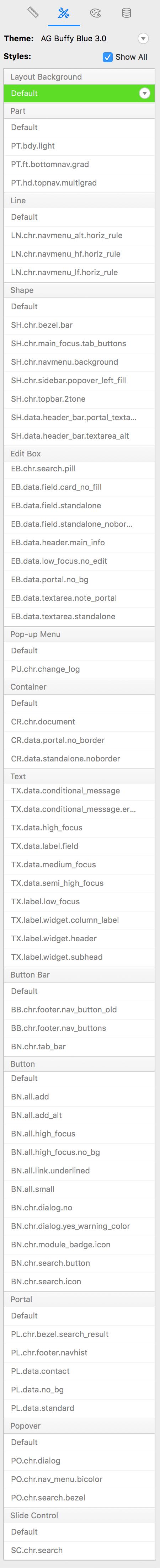
As you can see, these do not necessarily follow the rules, but they do convey enough information that I know what they are for, and having a framework to work within really takes some of the uncertainty out of it.
Another danger you may face is that FileMaker’s inspector cannot be expanded to make the single column of styles more readable (as of this writing, through version 17). When the style name gets too long, it’s not very readable until you hover over it. This becomes yet another challenge to overcome when working with styles (as if there are not enough already), so you should try to keep them short and simple.
Whatever system you come up with for managing your styles (feel free to use or modify mine), these guidelines should prove useful. Also, if you already have a style naming system that’s working for you, I would love to hear about it in the comments.