A new article by Jason Pamental in the TNW blog addresses some of the concerns designers face in attempting to design good, readable interfaces. One thing I like about this article is that he pays attention to something very close to my heart: typographic hierarchy....
Key Takeaways Typography is one of the most powerful tools in FileMaker interface design: How text is set, sized, spaced, and weighted communicates hierarchy, urgency, and brand before a user reads a single word, making typographic decisions a core part of any serious...
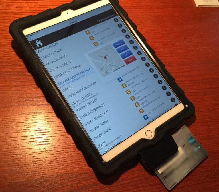
I thought I would share a quick note on an interesting project for a client. We are deploying a FileMaker solution on some iPad Air 2s, using FileMaker Go. This is an invoicing/POS system for plumbers to accept on-site payment from customers at the close of a job. We...
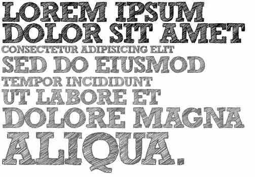
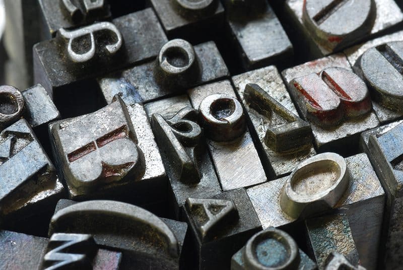
Many developer types are confused about the entire topic of typography. What’s the big deal? If you can read it, it’s working, right? Not necessarily. In part 2 of the “Getting Started with Design” series, we will explore what makes type so...
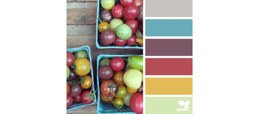
Key Takeaways Color in FileMaker design must serve function, not just aesthetics: Effective use of color in a database interface directs user attention, communicates status, and reinforces brand identity, but only when applied with intention rather than decoration....
If you were to ask me what’s the most common source of pain for new, first-time clients, I can say unequivocally that it’s double-keying – the practice of entering the same piece of information in more than one location (e.g. two different Excel...




 FileMaker AI: Guide, Industry Use Cases & Best Practices




Recent Comments