

Typeface Challenges in Database Design
A new article by Jason Pamental in the TNW blog addresses some of the concerns designers face in attempting to design good, readable interfaces. One thing I like about this article is that he pays attention to something very close to my heart: typographic hierarchy....
Getting Started with Design 2: Type
Key Takeaways Typography is one of the most powerful tools in FileMaker interface design: How text is set, sized, spaced, and weighted communicates hierarchy, urgency, and brand before a user reads a single word, making typographic decisions a core part of any serious...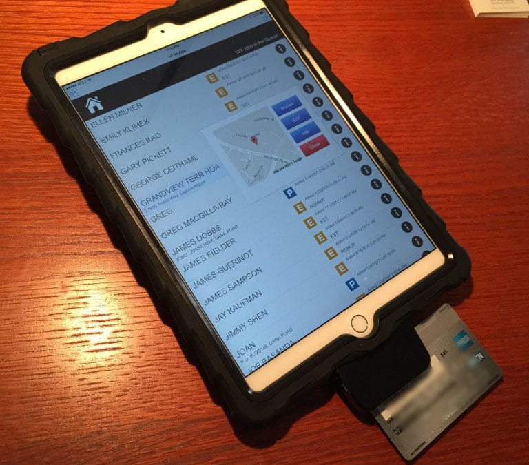
Ruggedized iPad Case with Swiper
I thought I would share a quick note on an interesting project for a client. We are deploying a FileMaker solution on some iPad Air 2s, using FileMaker Go. This is an invoicing/POS system for plumbers to accept on-site payment from customers at the close of a job. We...
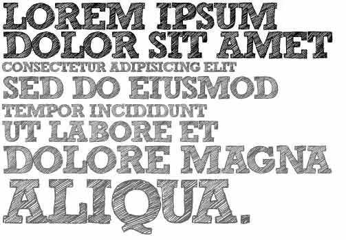
Getting Started with Design 2: Type
Many developer types are confused about the entire topic of typography. What’s the big deal? If you can read it, it’s working, right? Not necessarily. In part 2 of the “Getting Started with Design” series, we will explore what makes type so...
Getting Started with Design 1: Color
Key Takeaways Color in FileMaker design must serve function, not just aesthetics: Effective use of color in a database interface directs user attention, communicates status, and reinforces brand identity, but only when applied with intention rather than decoration....
Recent Posts
 The Future’s So Bright, I Gotta Wear Shades
- FileMaker Solutions for Education: Building Custom Student Management Systems
- The Future of FileMaker AI Integration: How to Integrate AI into FileMaker Applications
- The Future of FileMaker MCP Integration: Understanding Claris
- FileMaker ERP Software vs Off-the-Shelf Solutions for Manufacturing


Recent Comments