“I’ve Been Burned Before” My daughter’s first musical theatre gig was at age five, playing a sugar cube alongside talented kids of all ages in a production of “Beauty and the Beast.” One scene that particularly stood out for me was when the servant-turned-candlestick,...
In 1989, I had been working for a large metropolitan weekly newspaper for the better part of a decade. I was a jack of all trades when it came to the graphics department: graphics camera operator, paste-up artist, typesetter – all essential tasks when it came to...
If you missed Alchemy Consulting President Bob Shockey’s 35-minute webinar, presented in conjunction with FileMaker, Inc. on August 8, 2017, you missed out on the opportunity to see how quickly a new custom app for your business pays for itself. But, you are in...
Hopefully, you have had time to check out some of the fantastic new features in FileMaker 16. One of the more useful features, from a development standpoint, is the Layout Objects palette. This shows you a hierarchy of objects placed on your layout, including fields,...
FileMaker, Inc., a subsidiary of Apple Computer, announced the release of FileMaker 16. This version is packed with some very important new features that makes the FileMaker platform even more powerful. FileMaker was already a great product – so great that we have...
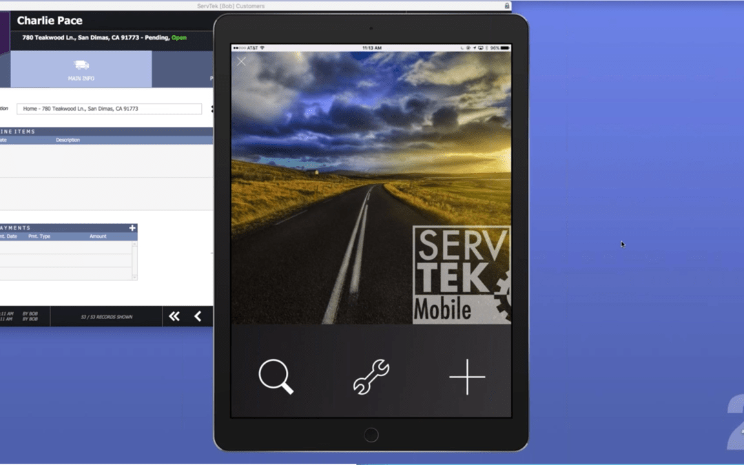
Service businesses are everywhere. In fact, much has been made of the fact that the U.S. economy has become primarily a service economy. Roughly 80% of our economy is now service-based. Much of that service is handled by field service personnel — people who come...


Recent Comments