Key Takeaways Color in FileMaker design must serve function, not just aesthetics: Effective use of color in a database interface directs user attention, communicates status, and reinforces brand identity, but only when applied with intention rather than decoration....
If you were to ask me what’s the most common source of pain for new, first-time clients, I can say unequivocally that it’s double-keying – the practice of entering the same piece of information in more than one location (e.g. two different Excel...
Key Takeaways A visual redesign can transform user perception and adoption of FileMaker solutions: Updating the look and feel of an existing FileMaker system, even without changing its underlying functionality, can dramatically improve user satisfaction, reduce...
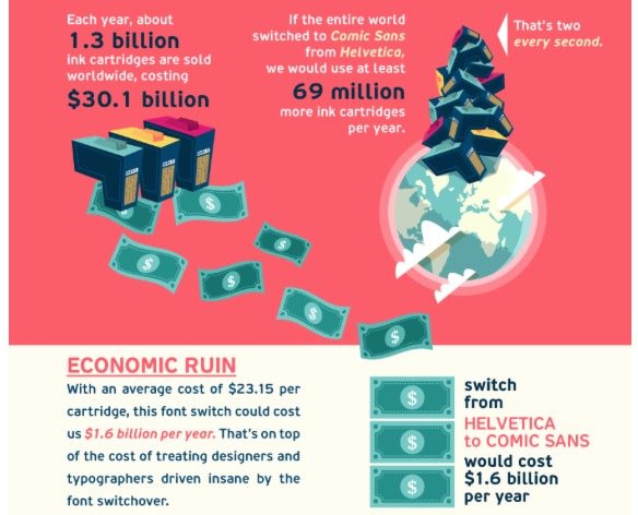
In what may be the definitive final argument in the Comic Sans wars (those of you who attended my FileMaker DevCon session know what I’m on about), Pixartprinting via Sara Boboltz of Huffington Post have given us an infographic that shows the true economic and...
Adopting a new software system for your company is a major undertaking, so you want to maximize your return on investment. In part two of our ROI series, we discuss one of the best ways to do that: bragging.? A significant benefit of improving your company’s...
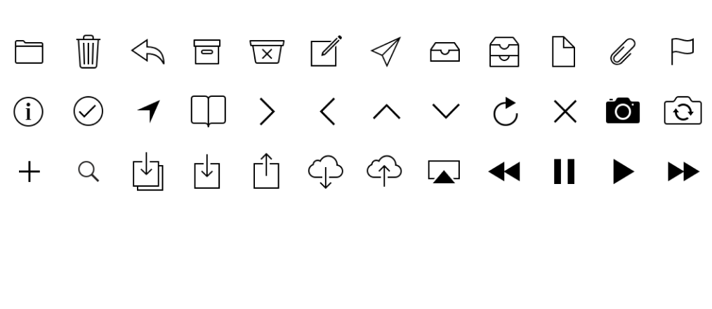
Key Takeaways Icons guide interaction and reduce cognitive load: The primary purpose of icons is to visually communicate actions, options, or statuses faster than text—helping users engage with software more intuitively and efficiently. Solid vs. outline icons...






 FileMaker AI: Guide, Industry Use Cases & Best Practices




Recent Comments