Key Takeaways
- A visual redesign can transform user perception and adoption of FileMaker solutions: Updating the look and feel of an existing FileMaker system, even without changing its underlying functionality, can dramatically improve user satisfaction, reduce training friction, and give a solution a second life.
-
Design consistency across layouts signals quality and intent: When buttons, colors, typography, and spacing follow a unified system throughout a FileMaker application, users navigate with greater confidence and the software communicates that it was built with care and professionalism.
-
Case study results demonstrate that design investment has measurable business value: Before-and-after redesign outcomes show that improved interface design reduces errors, increases data entry speed, and raises user confidence, making visual redesign a strategic investment, not a cosmetic one.
The Issue: The design that we created had a dark look to it, which we thought would be well suited to a solution that contains a lot of fashion design images (figure 1). Colorful images really pop against dark backgrounds, which is why software like Adobe Photoshop have a similar, dark grey look. However, the client made it clear that light type on a dark background was not going to cut it. They found it hard on their eyes, and asked if we could change it to something lighter. Back to the drawing board. Luckily, the actual placement of objects was not an issue, so all we needed to do was change the color scheme.
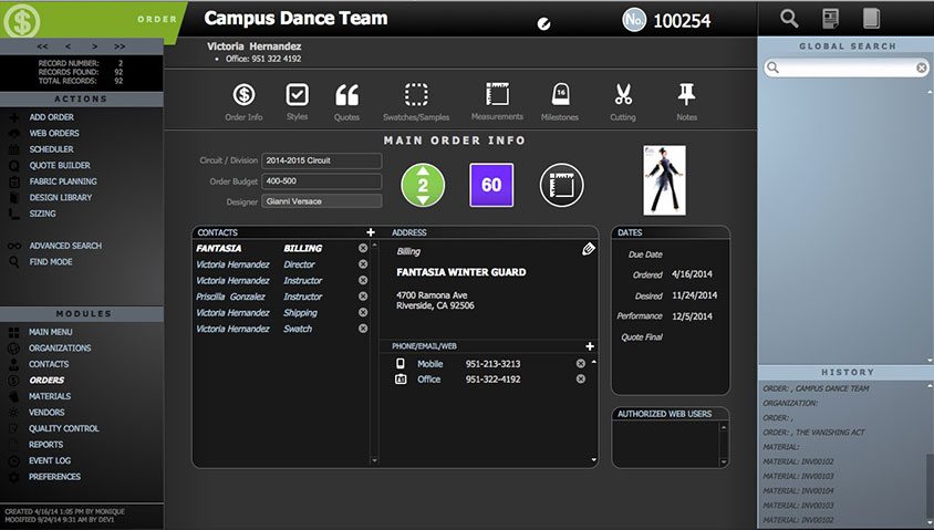
Figure 1: the original design.
First, I started with an existing layout. I made a copy of it and did some rough changes to the overall look. I then created a “sandbox,” a FileMaker layout that contains examples of each of the objects that are to be included in the new theme (figure 2). Every “Default” style is represented for each object, along with all of the other styles that will be needed.
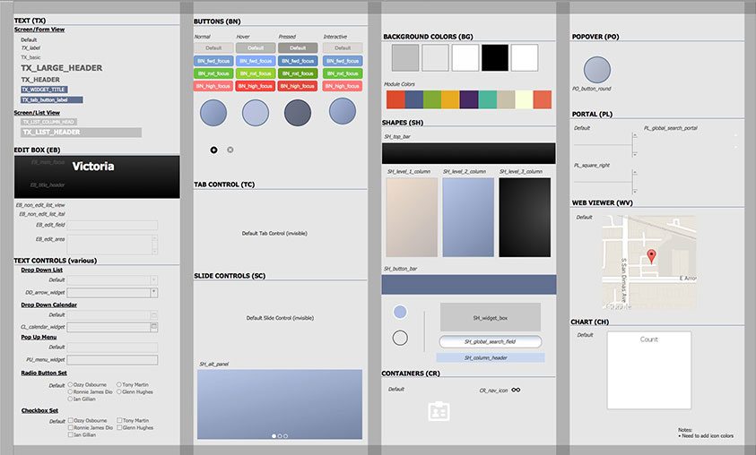
Figure 2: a sandbox
I then took a small side trip over to StylŌ, the free tool I created for managing themes and styles. I built a complete pre-visualization for all of the states of my objects and ran an overview report to check consistency across all styles. This gave me the peace of mind that, going forward, my theme would be consistent within itself in terms of things like corner bevels, colors used (particularly shades of gray), and state changes within the objects themselves.
I was careful to start with another theme besides Classic, which is extremely CSS heavy and would impose a performance overhead that I definitely didn’t need. I then saved a style for each of the layout objects I created, and saved them as a theme (figure 3). I then repeated the process for a list view, and saved that as a supplemental theme as well – it’s easy enough to copy what is similar between themes, but enough is different between a list view and a form view that they warrant separate themes.
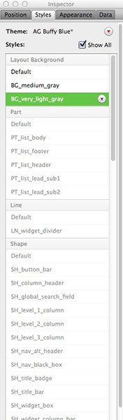
Figure 3: completed theme. Notice the carefully codified naming convention.
Now that I had a starter theme – which I named “Buffy Blue” because the warm-colored section reminded me of the old “buff” paper I used to print on in a prior career – I was now ready to apply the theme to a layout. I created a “redesign” folder in my layout manager and saved a backup, then a copy of the layout I wanted to work with first. The backup serves as a reference, and also a way to roll back if I decided I was going in the wrong direction. The other copy is where the real work happens. I applied the theme to the layout and watched as everything became kind of gray and generic; few of the objects on the layout had any styles applied, because the layout had been designed in FileMaker 12, which did not yet offer the themes and styles features of 13. As a result, there was no corollary to new styles. It’s important to note that, going forward, ?I was fairly strict and consistent in my naming conventions. Should I design more new “skins” in the future, this all gets much easier, as FileMaker respects similarly named styles when applying a new theme. If you name a button “BN_portal_add_button” in both the old and new styles, the new style will supplant the old automatically as the theme is applied. This is a huge shortcut that I would encourage every developer to exploit.
I then went about the process of applying the styles to the objects on the layout. Despite a medium degree of data density*, this really did not take all that long. I might have spent 90 minutes styling objects and cleaning up, including the time it took to create new styles that I had not foreseen when designing my sandbox. This first layout took the longest.
Once I had created the theme and applied it to my copied layout, it was time to move it into actual production. To do this, I went to the original layout, which had plenty of script references that required that it remain in place, and deleted everything on it. Next, I changed the theme to the new one, even though, at the moment, it was a blank page. I then copied everything on the new redesigned layout and pasted it into place. The objects all retained their styles and all was well with the world (figure 4).
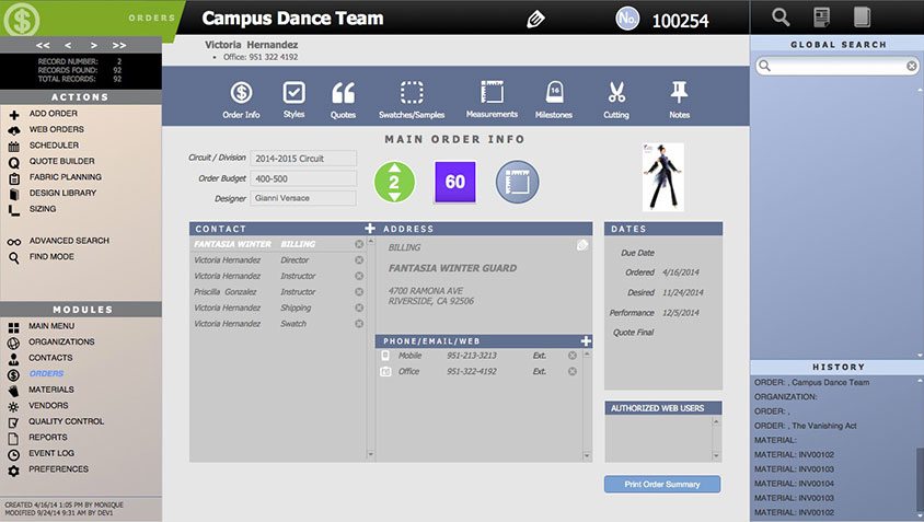
Figure 4: The completed redesign
The other payoff in all of this was that my staff was able to take the theme I had created and apply it across other layouts as well. This is a wonderful result of using themes: consistency is maintained not only across all layouts in the solution, but between different users, who might otherwise impose subtle differences in the way various objects are designed. Consistency is the real payoff with this feature; convenience is merely a byproduct.
While it is still not easy to redesign the overall look of an entire solution, it has certainly gotten easier in FileMaker 13, especially if you follow an organized process such as I have outlined above. Just as consistency is the payoff for using themes and styles, your own ability to remain consistent makes the entire chore much easier.
*I’ve coined this term to represent the amount of data that must be displayed in a layout based on the complexity of the task being performed. A complex task might require more data, hence a higher density.