Going through the pain of working with a feature-rich new platform – in my case, WordPress and a new theme pack – I am reminded of what our users face when we present them with new systems. It’s a difficult situation for both of us; the new user wants to come up to speed fast and get work done. The developer wants to provide good support without being overwhelmed, and without creating a bad first impression for the user. In my dialogs with the developer of the theme pack – he’s in London, so I drop a message in his blog late in the day, and in the morning I have an answer – I strive to be complimentary while presenting my issues, having been in his shoes so many times.
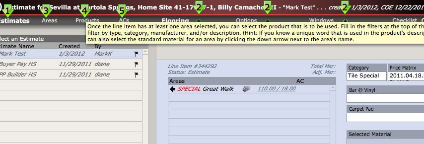
A good answer to bridging ?the “deployment ?gap” is to build in visual and textual cues for the user to follow. The trick is to make them clear enough that they work, but not hammer the user so hard with them that they become a speed bump for the remaining lifetime of the user’s interaction with the system. One way to deal with this is to make these cues turn on and off with the click of a button (see illustration for an example). But this is only a partial solution. Maximum benefit can be achieved only through careful planning with time as an element to be considered.
I will be sharing more on this topic in upcoming posts.


